There are many ways to improve your content marketing, and double or even triple your conversion rates. Today, let’s focus on the most important aspect of content marketing – your content. Here are five ways to create high-converting content to boost your conversions.
1. Write a killer headline
Your headline is the first thing readers notice about your blog post or landing page content. Whether or not the headline captivates them will likely determine if they continue reading the content, or bounce.
Although different variations of headlines work, there are some common elements in successful headlines. HubSpot and Outbrain conducted a study of 150,000 article headlines and discovered:
- Headlines with eight words performed the best in click-through rates.
- Headlines containing a colon or a hyphen performed 9% better than those without.
- Odd numbers in list posts have a click-through rate 20% higher than even-number lists.
- Ending a headline with a question mark results in a higher click-through rate than using an exclamation point or a full stop.
You can use these common characteristics of successful headlines as the foundation for writing killer headlines that convert. Clearly explain what the content is about in a few words, and if it needs a little bit more detail, include a short explainer after a colon or hyphen. And when creating a list post, keep it to an odd number.
Write a killer-conversion headline in 8 words and add a question mark, says @shane_barker
Click To Tweet
In addition to these basics, try to use words and phrases that are more likely to convert. According to WiderFunnel, words like “you,” “because,” “free,” “new,” and “instantly” help drive conversions. You can find more high-converting words in a list of 700-plus power words compiled by OptinMonster.
It can also be helpful to come up with several potential headlines. Then use an analyzer tool like the ones from CoSchedule or Advanced Marketing Institute to see how well each headline would perform.
Example: The original headline for this post – How to Create High-Converting Content – received an emotional marketing value (EMV) score of 60% from the Advanced Marketing Institute tool. That EMV is about double the average EMV score for most professional copywriters’ headlines.
Once you analyze your list of potential headlines, use the one with the highest score(s) to drive more conversions.
HANDPICKED RELATED CONTENT:
2. Intrigue readers with your intro
Your headline should attract readers, and your intro should intrigue them enough to make them stay. It should make them want to read more. In other words, your headline is the bait, and your intro is the hook.
Your headline is the bait, and your intro is the hook, says @shane_barker. #contentmarketing
Click To Tweet
For blog posts, the first three to four sentences are the intro. It needs to be to the point and should clearly explain how readers can benefit from the post. Otherwise, why should they keep reading?
In the case of landing pages, the subhead acts as the intro and is equally important for intriguing and converting your audience. The subhead should highlight the main benefits, preferably with bullet points so the information is easier to scan and process.
Example: You can find an excellent example of an effective intro on the Consulting page of Content Marketing Institute. As you can see in the screenshot below, the first two sentences talk about CMI’s mission and focus in regards to its consulting service. Those statements lead into a third sentence, which highlights the “biggest benefit” of the service.
An Editor’s Rant: 7 Questions Every Writer Should Be Asking
3. Don’t forget to add visuals
Adding visual elements to your text content can make a huge difference in performance. It attracts and engages your readers, while adding more substance to your content. It also is an excellent way to break up longer pieces of text, making your content easier to scan and understand.
Add visual elements to your text to make a big difference in conversion performance, says @shane_barker
Click To Tweet
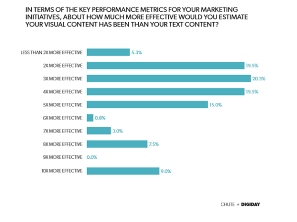
A study conducted by Chute and Digiday noted that 20.3% of marketers found visual content to be three times more effective than text content. And another 19.5% found it to be four times more effective.
What makes the best kinds of visuals largely depends on the type of content you’re creating. Here are five types of visual content that can help you increase conversions:
Original graphics
Adding original graphics to your blog posts shows your readers your content is unique and you take the time to come up with something valuable and original. Even if you don’t have an in-house designer to help you with this, you can always use tools like Canva to come up with your own graphics.
Original graphics can work great as featured images for your blog posts. It’s best to try to come up with something fun and eye-catching, yet still relevant to the topic being covered in the post.
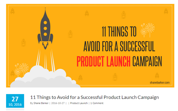
Example: Here’s an original graphic my team created for one of my blog posts. As you can see, the image instantly catches your eye, and is relevant to the topic.
Charts and graphs
If you’re quoting studies or stats to support your point, include charts and graphs for further validity. Sure, you could include a simple link to the source of the information, but people may not be interested in visiting another website just to see if something is true. When you include charts or graphs alongside your content, you make it easier for readers to process the information.
Screenshots
If you’re explaining how something works, screenshots are an excellent way to enrich your content. Original screenshots can explain things visually in ways you can’t always do with words. You can show how-to tips for a certain tool or display an example of a strategy in action. You also can use screenshots as proof of what you’re claiming.
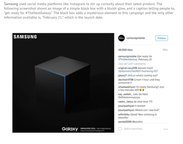
Example: In a blog post about product launch ideas, I provided readers an example from the Samsung Galaxy S7 launch. I included a screenshot of its Instagram post to show exactly how the brand used social media teasers and a countdown to market its product launch.
Infographics
Maybe you’ve conducted a study and compiled some useful data. Complex data may be difficult for your audience to understand with words alone. Or maybe you want to create useful, bite-sized content to help explain a complicated concept, product, or strategy.
In these instances, you can create infographics to transform your complex information into intriguing visuals. Tools like Piktochart and Infogram are great for creating eye-catching infographics, even for beginners.
You can also use infographics to repurpose your old text. Look for some of your best-performing blog posts, then turn them into a shorter piece highlighting the main points. After that, use the shortened piece to create an infographic.
7 Principles to Creating Great Infographics
Videos
Images or text alone may be insufficient for explaining how a product works or how people can benefit from it. You could include a short explainer video on your landing page to help boost conversions. Or include video testimonials or reviews from real customers and/or influential figures.
Include a short explainer #video on your landing page to help boost conversions, says @shane_barker
Click To Tweet
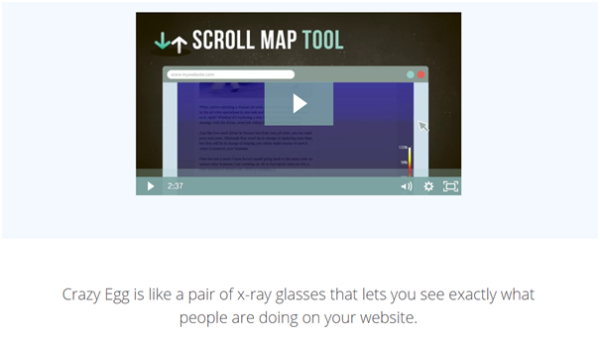
Example: Conversion Rate Experts helped boost Crazy Egg’s conversion rate by including a video on its home page. Though the video message was the same as the text on the page, it drew the attention of people who prefer to learn visually and helped drive 64% more conversions.
HANDPICKED RELATED CONTENT:
4. Use an easy-to-read format
Another important factor that influences your content’s ability to convert is the format. You may have plenty of useful tips and information that your readers would appreciate. But writing about them in huge chunks of text doesn’t make it easy for people to read and process. That kind of format can hurt your conversion rate, as people may be unable to understand what you’re trying to say.
Here’s what you can do to make your content more reader friendly:
- Break up blocks of text into shorter paragraphs with a maximum of five to six lines.
- Use bullet points wherever applicable to highlight key points.
- Add other elements like visuals to illustrate your points and break up text blocks.
- Include subheads whenever appropriate to make your content easier to read.
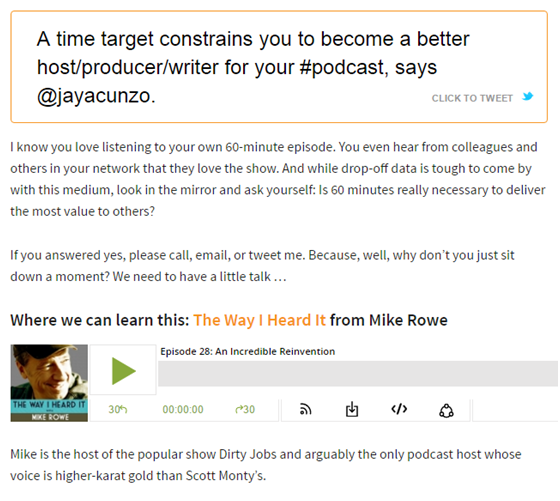
Example: You can see some excellent examples of reader-friendly formatting in many CMI articles – short, easy-to-scan paragraphs, subheads, and screenshots. But what’s really noteworthy about the CMI article format is the “click to tweet” plug-in that highlights main points. You can see it in action in the screenshot below from one of Jay Acunzo’s posts.
The Ultimate Blog Marketing Checklist: 65 Tips, Tools, and Resources
5. Create a compelling CTA
Your call to action should convince people to take a desired action. Maybe your CTA is at the end of a blog post, urging people to subscribe to your newsletter or download your latest e-book. Or maybe it’s a CTA on your landing page for a product or service you’re offering. Even your video content needs a CTA to drive conversions.
Even your video content needs a call to action to drive conversions, says @shane_barker
Click To Tweet
Whatever the case, you need to make sure your CTA copy compels people to convert. Here are a few basic tips:
- Clearly explain what you want people to do. The idea is to get people to take action. Make your CTA actionable by beginning the sentence with a verb. For example, “Get your free guide now,” or “Start saving today.”
- Be brief and to the point. If you include a CTA at the end of a blog post, you can write a full sentence. For a landing page, limit the CTA to five to six words.
- Focus on what they’re going to get or how they’ll benefit from the action.
- Create urgency with words like “now,” “instant,” or “today.”
- Create exclusivity using words like “custom” or “exclusive.”
- Highlight benefits with words like “free” or “save.”
While it may not be possible to use all of these tips in one CTA, you can create variations of your CTA copy. Then run an A/B test to see which drives more conversions.
Example: The OptinMonster landing page showcases an excellent example of a compelling CTA. The copy urges users to “Get OptinMonster Now.” This CTA is short and to the point. It focuses on what people are going to get. And by using the word “now,” it creates a sense of urgency.
13 Ways to Get More Opt-Ins From Your Content
Conclusion
These are some of the most effective ways to create high-converting content. You may be a novice content marketer or an expert just looking to expand your knowledge. Either way, these easy and effective tips can help you improve your content to boost conversions.
Are there any additional tactics not covered above that have worked well for you? Please share them in the comments.
How’s this for a compelling CTA? Get free content marketing advice every day. Subscribe today to receive the CMI newsletter.
Cover image by Joseph Kalinowski/Content Marketing Institute
The post How to Create High-Converting Content appeared first on Content Marketing Institute.



No comments:
Post a Comment