Sometimes branding fails are caused by something getting lost in translation. For example, when Coors translated its slogan, “Turn It Loose,” into Spanish, it used a colloquial term for diarrhea.
More often, though, branding fails happen because of a lack of a clear style guide, which can result in inconsistency or miscommunication among your content team.
Branding fails happen because of a lack of a clear style guide, says @SashaLaFerte.
Click To Tweet
Pardot research notes that 80% of consumers say “authenticity of content” is the most influential factor in their decision to become a follower of a brand. One way to foster authenticity is by achieving consistent communication and branding by creating a style guide containing instructions for all parties creating content for your company.
This article addresses why your organization needs a style guide, details what to include in your style guide, and gives examples of top-notch style guides to ensure streamlined external communications.
Why you need a style guide
First, what is a brand style guide?
A brand style guide is a holistic set of standards that defines your company’s branding. It references grammar, tone, logo usage, colors, visuals, word usage, point of view, and more.
A brand style guide references grammar, tone, logo usage, colors, visuals, point of view, says @SashaLaFerte.
Click To Tweet
By creating a complete brand style guide, you ensure that your published content is consistent, polished, recognizable, and more enjoyable. A thorough, well-thought-out style guide puts your readers first. It creates a recognizable, engaging voice and personality that readers can form a more personal connection with.
Brand Guidelines to the Rescue for Clear, Consistent Stories [Example]
What to include in your style guide
GatherContent recommends keeping a style guide to between four and five pages. Anything longer is too much to digest. Before creating a style guide, research who your audience is and what they want. Create a style guide based on what resonates with them.
Keep style guide between 4 & 5 pages or it’s too much to digest. @GatherContent via @SashaLaFerte
Click To Tweet
If you already have a mission statement or boilerplate “About Us” description for your brand, start there. Revisit it and make sure it’s not only on point with what it says but how it says it. If you’re defining your brand voice as conversational, but your mission statement is filled with corporate jargon, it’s probably worth revisiting.
From there, create a table of contents for your style guide and use it as an outline. All style guides should include an introduction. This might include a mission statement, letter from the CEO, About Us page, or general overview of the company’s brand and audience. Next create a section on how your brand talks and writes, and another section on branded visuals. Here’s a breakdown of what these sections should include.
Writing section
Roughly 45% of a brand’s image can be attributed to what a brand says and how it says it. Details like whether to use “&” or “and,” or if you should use the numerical or written-out versions of numbers may seem trivial. But the sum total of these details adds up. If they are consistent throughout your published work, they convey a coherent voice, coherent thinking, and a credibility impossible to attain without this consistency. Here are some tips for ensuring that your brand guide aids in creating first-rate content:
- Baseline guide: Use an existing style guide (like AP Style) as a baseline. Add your own changes, such as whether to use the Oxford comma or general best practices for emojis.
- Formatting: Add a small section around formatting. Include details on how to format bullets, lists, hyphens, and quotes.
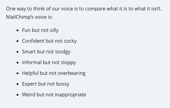
- Tone and voice: Give descriptions of these and examples of how the tone and voice might be right or wrong. If you want a “playful” tone, explain what that means. This section should also include information on sentence structure. Do you want long complex sentence structures, a mix, or Hemingway simplicity? (Pro tip: You don’t want long sentences if you want to be persuasive.)
In your brand style guide, give descriptions and examples of tone and voice, says @SashaLaferte.
Click To Tweet
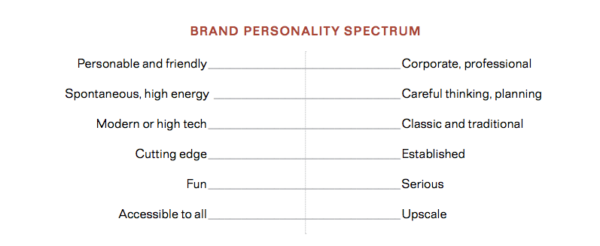
- Additional details: Include a section on how to engage, words to stay away from, and any other details that are important to your brand. Use the brand personality spectrum below to get a better idea of what’s important to your brand’s written content.
Focus Your Marketing: Define Your 3(ish) Critical Words
Visual section
Color increases brand recognition by 80%, according to a study conducted by the University of Loyola, Maryland. Visual cues are as important to brand consistency as the written aspects. Consider including these elements in your style guide’s visual section:
- Formats: Include information on how to stay on brand with other formats of content, including infographics, video, motion graphics, etc.
- Colors: Detail your brand’s palette of colors, including function. Make sure to include the hex, CMYK, and RGB codes for each color, as well as Pantone numbers.
- Logo: Include all versions of your logo and examples of proper uses. If you have older or frequently misused versions, include them as “don’t use” examples.
- Fonts: Include all brand fonts for headings, paragraphs, etc., and their uses.
- Presentation format: Include a link to a company slideshow template for presentations.
Brands with awesome style guides
Here’s a list of brands we all know that have first-class style guides, and what makes them special.
Spotify
Spotify nails the “tone of voice” section in the style guide by defining it as easy, personal, and fun. While these words may seem ambiguous, Spotify makes it clear with exposition and examples:
- “Spotify just got louder, here’s Metallica!”
- “Choose the music you love, or let Spotify surprise you.”
MailChimp
MailChimp’s style guide thoroughly prepares any contributor to create on-brand content. Check out its style guide if you’re looking to create a guide with a lot of detail. Highlights include the Voice and Tone section and Word List. MailChimp also breaks out writing guidelines by content type, from emails to blog posts to social media.
Uber
From the start of Uber’s style guide, you get the idea of what the company is all about: moving things. Whether it’s people, food, or animals, Uber opens the style guide with the phrase “Moving ____.”
The best part of Uber’s style guide is the branding of its branding guidelines. The guide is packed with GIFs and videos that convey the very movement Uber is so proud of. Uber uses this site to not only describe brand guidelines but to announce changes in branding and the thinking behind it.
Conclusion
Now you know why a good style guide is important, what it should look like, and what to include. It’s time to create one for your company. Include the marketing team, sales team, and any other creatives working on your marketing and products when creating a style guide. Upon completion, share it company-wide, and store it as a living document in a place that’s easy to find.
Want to improve the voice of your content marketing program? Subscribe to CMI’s free daily email or weekly digest.
Cover image by Joseph Kalinowski/Content Marketing Institute
Editor’s note: We appreciate Curata’s support of Content Marketing Institute as a paid benefactor. This article was reviewed and edited independently to ensure that it adheres to the same editorial guidelines as all non-sponsored blog posts.
The post How to Write a Style Guide for Your Brand appeared first on Content Marketing Institute.


No comments:
Post a Comment