 Our content was too academic and didn’t resonate with our audience. When we focused on making it more readable for our audience, business grew. What about you? Is your brand deliberately centered on readability?
At its purest, readability is about keeping things simple. It’s about explaining things in as straightforward terms as possible. Content marketers deliver a wealth of ideas and information, but it’s not always presented in the best way. Among the potential problem areas:
- Length of words and sentences
- Grammar
- Structure of content
- Use of language
Poor readability is a signal that you’re not looking after your audience. It can mean you:
- Spend a lot of time, money, and other resources producing material that doesn’t fit its purpose
- Don’t have an engaged audience
- Lose audience trust, which diminishes customers’ relationship with your business
- Find your customers taking their business elsewhere
- Lose revenue
Poor readability signals you’re not looking after your audience, says @stevelinney. #writingtips
Click To Tweet
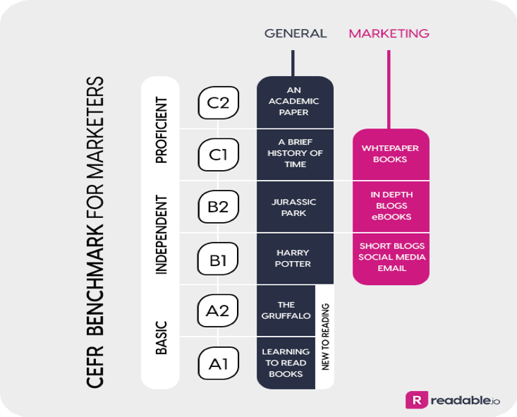
When the Dutch government used readability tools, it found its content’s readability level (C1 – see scale below) was too high for the majority of readers in the Netherlands, who are at a B1 readability level.

Given that most readers could not fully understand the content distributed by the government, it was not only a waste of taxpayer money but it could have hurt people’s well-being if they couldn’t understand the content related to topics such as social security.
When my toddler fell down the stairs, my wife and I were scared. We went into full-on protective mode and searched on Google to see what danger signs to watch for and whether we should take him to the hospital. (He was fine, as it wasn’t a bad fall.) I’d hate to have been reading advice that was too difficult to understand quickly. Especially when panic, stress, and a crying toddler is added to the mix.
Yet, though the average American reads at an eighth-grade level, consumer-focused medical content frequently is too complex for the average reader, as shown in a comparative analysis of patient education materials from 16 medical specialties.
In our business, we collect data on readability and have discovered common issues include:
- Overuse of long sentences
- Words with too many syllables
- Reliance on industry buzzwords and jargon
The good news is these mistakes can be avoided by adopting readability measures as part of your content assessment process.
Long sentences, words w/ too many syllables, buzzwords & jargon make #content harder to read. @stevelinney
Click To Tweet
HANDPICKED RELATED CONTENT:
How to adopt readability, a step-by-step guide
I will take you through nine steps to ensure that your audience is more likely to consume and engage with your content.
1. Have a customer focus
This is content marketing 101, but it’s the most important aspect. Create content that:
- Is genuinely useful to the reader
- Is relatable
- Answers a question or solves a problem
- Informs, entertains, or educates (preferably all three)
The relatable point is an essential one. Too much content, particularly on websites, is me-me-me – the brand only talks about itself. Avoid doing that at all costs. For example, turn the focus of how you do something to how your readers can benefit by adopting the same practice.
2. Get a baseline score
Once you have your first draft ready, it’s time to determine its readability score. You can use one of several free and paid tools. (Disclosure: My company, readable.io, is on one of the lists.) With these tests, you can learn the Flesch-Kincaid U.S. grade level along with other standard readability assessments, such as the Flesch Reading Ease, Gunning Fog Index, CEFR, and SMOG Index. Some highlight word by word (or sentence by sentence), the potential readability challenges.
3. Revise to achieve correct reading level
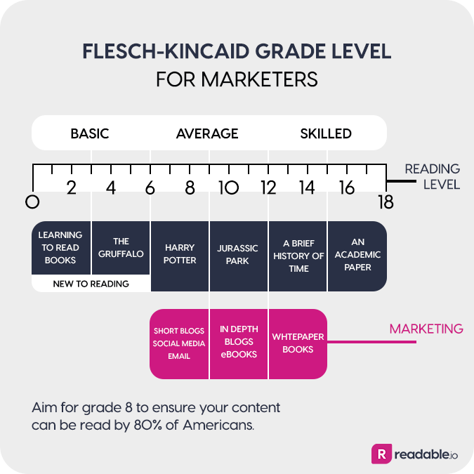
As a general rule of thumb, we aim for a reading level of grade eight for our blog posts – which is the level of a 14- or 15-year-old – to ensure that a wide audience can understand our content. We focus on grade 10 for e-books and grade 12 for white papers and books.
Your personas or audience description will help you pick the right grade level for your content.
Your personas will help you pick the right grade level for your #content, says @stevelinney. #writingtips
Click To Tweet
4 . Shorten your sentences
The No. 1 element that readability algorithms agree on is that long sentences are bad. Thankfully, it’s an easy fix – shorten your sentences.
The No. 1 element that readability algorithms agree on is that long sentences are bad. @stevelinney…
Click To Tweet
Full stops and bullet points are your friend. Use them, and use them often. You’ll soon have content that:
- Can be easily read online
- Doesn’t drag and drain your reader
- Is structured in a reader-friendly way
5. Reduce the number of long words
Long words are another red flag for readability. Where possible, look for shorter alternatives (e.g., you might replace the word “alternatives” with “options”).
Now, this isn’t always possible, as your organization likely has some words that must be used. Edit to minimize the number of long words but don’t make everything as readable as possible to the detriment of your brand message.
6. Scrub your copy of buzzwords, geekspeak, jargon, and acronyms
Resist the temptation to fill your content with buzzwords, geekspeak, jargon, or acronyms. They limit the content to those who are already in the know. If you must use challenging terms, explain them.
When working in my first job in London, I had the delight of editing blog posts written by structural engineers. They loved to fill their content with as much jargon and as many acronyms as they could to try to look smarter than their peers. They didn’t care about readability and their audience.
HANDPICKED RELATED CONTENT:
7. Don’t overuse adverbs
People frequently tend to liberally overuse adverbs, eventually causing sentences to be really cluttered.
If you take all of the adverbs out of that previous sentence, how much better does it sound?
Like anything in life, moderation is key.
8. Set a balance between formal and conversational
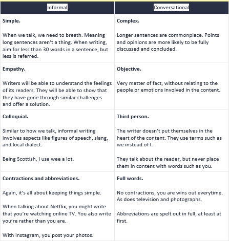
My preferred style of writing edges toward conversational with a formal tone, but you have to match what your audience is expecting. The two styles of writing can be split easily:

In conversational content, I aim to make it feel like I’m talking directly with you. It makes the reading experience more personal. It also feels more natural to me to write this way, even after years of writing for a B2B audience.
Just because you’re writing for business doesn’t mean you have to write with no personality. Make sure the flow of copy is natural and not forced.
Make sure your copy flow is natural to ensure that it’s readable, says @stevelinney. #writingtips
Click To Tweet
In some cases, conversational or informal tones are not appropriate (e.g., a privacy policy). But formal doesn’t mean you should abandon readability. Clear language always wins, formal or conversational.
9. Seek feedback and proofread
Common-sense time, again. As many pairs of eyes as possible should read a document before it goes live. As a writer, you can be too close to the text. Another person can give you the perspective of a reader and point out areas of improvement.
(There have been some great additions to this blog post since my first draft, suggested by those who proofread it. My vanity as a writer won’t let me tell you what they are, just that they exist.)
Conclusion
Readability and content marketing are about the same three principles:
- Keep your audience at the center of everything you do.
- Inform, educate, or entertain your audience.
- Keep it simple.
Keeping things simple isn’t easy, but practice makes better content. The more you stick to readability principles, the more readily your audience will consume and engage with your content.
Please note: All tools included in our blog posts are suggested by authors, not the CMI editorial team. No one post can provide all relevant tools in the space. Feel free to include additional tools in the comments (from your company or ones that you have used).
Check out the readability of CMI’s free weekday newsletter. Subscribe today.
Cover image by Joseph Kalinowski/Content Marketing Institute
The post A Primer to Boost Your Content’s Readability appeared first on Content Marketing Institute.

No comments:
Post a Comment