Let’s be honest, everybody wants to own a modern and stylish website that will quickly catch an eye of your potential clients or customers and be the best in their deal. Needless to say, it is an understandable desire. Seeing that today I’m going to tell you about several cool options that one can use to make their site more qualitative and entertaining but not only this… Actually launching a stylish website is a real must-have for today, as such step gives one a quick chance to develop their business and become their own boss.
That is why now you can find a plenty of various recent features that different companies propose to use to set up a cool site. Still, remember that measure is a treasure and keep in mind that sometimes even the most gorgeous and inimitable options or design elements may easily turn your online project into a real nightmare, when they are overused. But do not worry, as I’m here to assist you on the way to your dream and today I will show you 5 things that one should use wisely. Are you ready to meet this helpful list? I’m sure you are, as you are on this page right now. Thus, let’s start!
1 Background Images
Without a doubt, background image WordPress designs are a cool thing that both brings a charming design to your online project and shows your best products to its guests. That is why this feature is pretty popular today. What should you know about it? Well, first of all such images should have a great quality, as if they are don’t your website will look unprofessional. Secondly, these photographs shouldn’t have many details for your visitors to focus on the site’s subject. And here we go to the most important point: background images shouldn’t be overused. Actually, such step will definitely make any website uncomfortable for its guests and we all know that comfort plus beauty is an undeniable formula of success. What is more, I suggest you not to use extremely bright pictures if you would like to post some text on this place of your page. To continue it will not only create a diversion but also can make your text unreadable.
2 Background Videos
What is more, one may get the same problem with background videos when they are overused. In addition, there will be too much motion for those customers that would like to focus on the subject of your online project. Here you can see a winning example of website with the option in question.

Check it out on TemplateMonster
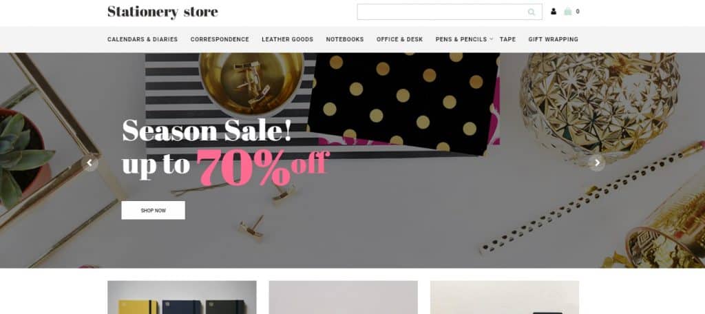
3 Cool Banners
Yep, banners are useful! They quickly attract the attention of your potential customers and tell them a lot of info about your products / services, (e.g. special offers, new items, discounts, etc.) so worthy banners are always in trend. Still, just imagine how your website will look when it has a lot of banners. All in all, people will be bored with a huge amount of advertisement (even if it will be the most advantageous one) and they certainly won’t like such project. To continue, don’t make your banners too big and never use such awful thing as clickbait.

Check it out on TemplateMonster
4 Newsletter Pop-up
To make a long story short, it is a powerful and flexible plugin, which is popular because it gives one a possibility to make lightbox pop-ups that help them to get more newsletter subscribers. Consequently, such step will also help you to promote different products, show new media or deliver special offers to the guests of your online project. I’m sure you have seen this problem a million times while surfing through the web space: some of the website owners overuse the feature, so their customers see the window that proposes them to subscribe 5 or even 10 times per day… Unquestionable it is an irritating thing that will not help one to increase their audience. Moreover, it also makes people unsubscribe, even if they wanted to get the letters from your site before.
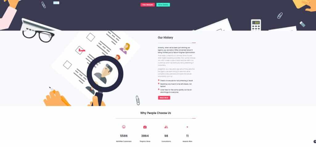
5 Counters
As you may know, counters are another popular feature that is used for many websites. What can I tell you about it? Yes, that’s right: do not overuse it. Believe me you don’t need to put counters everywhere, so just make a stand-alone section for them. As a result, people will see the numerals they are interested at and will not look aside at the same time. To illustrate, below is another screenshot of a modern website template, which shows the best way of using counters (made by TemplateMonster and powered by WordPress):

Check it out on TemplateMonster
As you can see there are a lot of popular and helpful features that can literally turn your online project into a nightmare when they are overused. Thus, do not try to get all the trendy options that you will put everywhere. Be sure, it is always better to use 3 – 5 modern options that are appropriate then 10 features that will definitely overload your long-awaited website. To sum everything up, remember about comfort! Not sure if your site is good enough for its users? Well, just log out of your admin panel, enter your page as a client and try to buy something or find some needed information.
Doing this you will see all the disadvantages of your online project and realize that nobody likes stylish features that disturb their work. Found some minuses? Oh, don’t be upset, as now you know about them, so you can easily fix the situation and increase the popularity of your online business. Just stay unique and remember that there is nothing impossible for a modern person!
To finish with, what do you think about the features mentioned in this post? Maybe you have already seen the descried problem as an owner of a website or its guest and now have your opinion to share? For these simple reasons, don’t hesitate to leave all your thoughts and questions in the comments below this post, as I am always happy to hear from you!
Original post: Cool Design Elements That Turn Your Website into Nightmare if Overused
This post is courtesy of: https://www.dailyblogtips.com
No comments:
Post a Comment